
UI/UX Designer / Product designer
User research, Wireframes, Prototypes, Mockups and Testing
CineSnack is a snack ordering app for movie theaters
this is a passion project created for the UX google certificate course.

People lose valuable time doing long lines to purchase food or snacks when getting into the movie theaters.
To create a better experience by giving the customer the option of ordering their food before getting into the movie theater.

I conducted a survey where 11 people participated the study was targeted to people who like movies most of the participants were open to the idea of the app.

Have to wait in line
to get snacks
Long lines and
wait times
Don't want to be
Late for the movie
- Lack of innovation
- Website doesn't have an order online option
- Outdated website
- There's room for innovation, there's room to create a good user experience when ordering
- There are opportunities in the desktop and mobile version, 35% of millennials purchase on a desktop, but Gen Z uses more the mobile phone, for that reason, I'll focus on creating an app that serves all generations.
Products with a brief description
separated by categories

Navigation bar is going to include
Home, Favorites, Account, and Cart
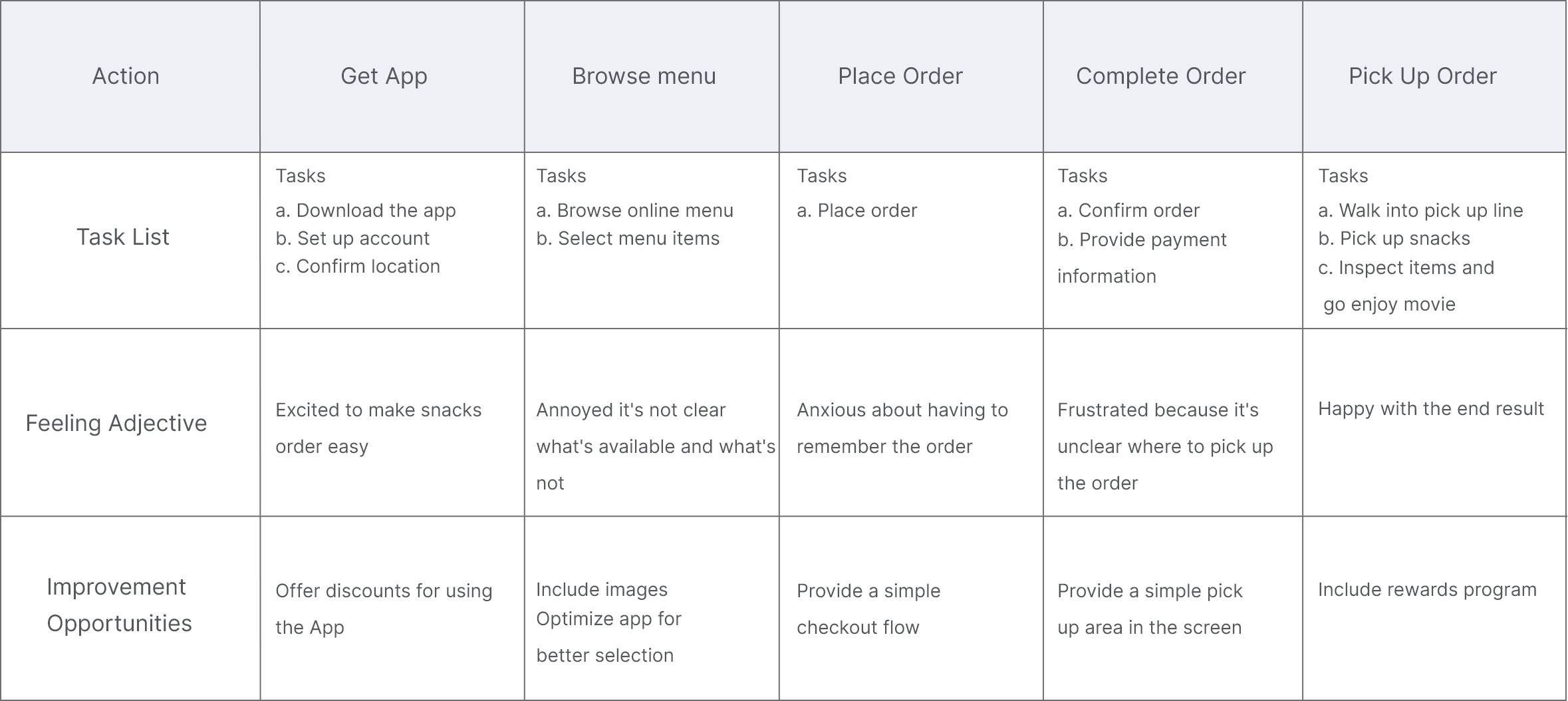
Get App > Set Up Account > Confirm location > Browse Online Menu > Select Menu Items > Place Order > Confirm Order > Provide Payment Information
Accessibility problems in early design, contrast test failed, after the usability studies, I added additional options to choose from and adjusted the color palette to pass accessibility.


The findings are shared below.


Users want to
order quickly
Users want more
customization options
User notice
contrast problems
WCAG Level AAA requires a contrast ratio of at least
7:1 for normal text and 4.5:1 for large text.


Contrast test was 3.28 didn't pass
AAA Normal, AA Normal, AAA Large
Upon changing the color palette and making a couple of changes in the design the idea was to create a straightforward process, a simple form that allows the user to sign in to the app without too much hassle.
Creating a native account instead of using 3rd party services seems to be a better fit for Cinesnack, it's more secure to the users and a more beneficial business model as well.


The design of a catalog of products was intentional, so users could distinct from the different options, the search bar purpose it's for the user to have easy access to a specific item.
The straight forward payment process, the app allows different types of payment giving the user different options, colors, and prompts where added to give the user a better experience
WCAG Level AAA requires a contrast ratio of at least
7:1 for normal text and 4.5:1 for large text.

The contrast test was 7.42 which pass
AAA Normal, AAA Large, AA Normal, AA Large
.png)

Rufous red as primary color, red is a very strong color this one specially is a very saturated light warm red
A softened white, black and grey to blend naturally with the toned-down primary color


#A81C01
#A81C01 - #DB0000


#1A1D24
#5D5D5D
#FEFCFC

In this project, I learned the importance of exploration, iteration, and user research, UI design needs to be functional.
Accessibility should be a must in every app, contrast is the most common mistake, designing with accessibility in mind makes the design better for everybody.
This was a really fun project, I was fortunate enough to receive feedback from friends, family, and also great designers, even though this was a solo project I due some of the project's success to everybody who provided feedback.